Academic project developed within the Standards, Usability and Accessibility course of the Master’s in New Media and Web Practices, at Universidade Nova de Lisboa between April and May of 2021.
First things first: What is PopTalk?
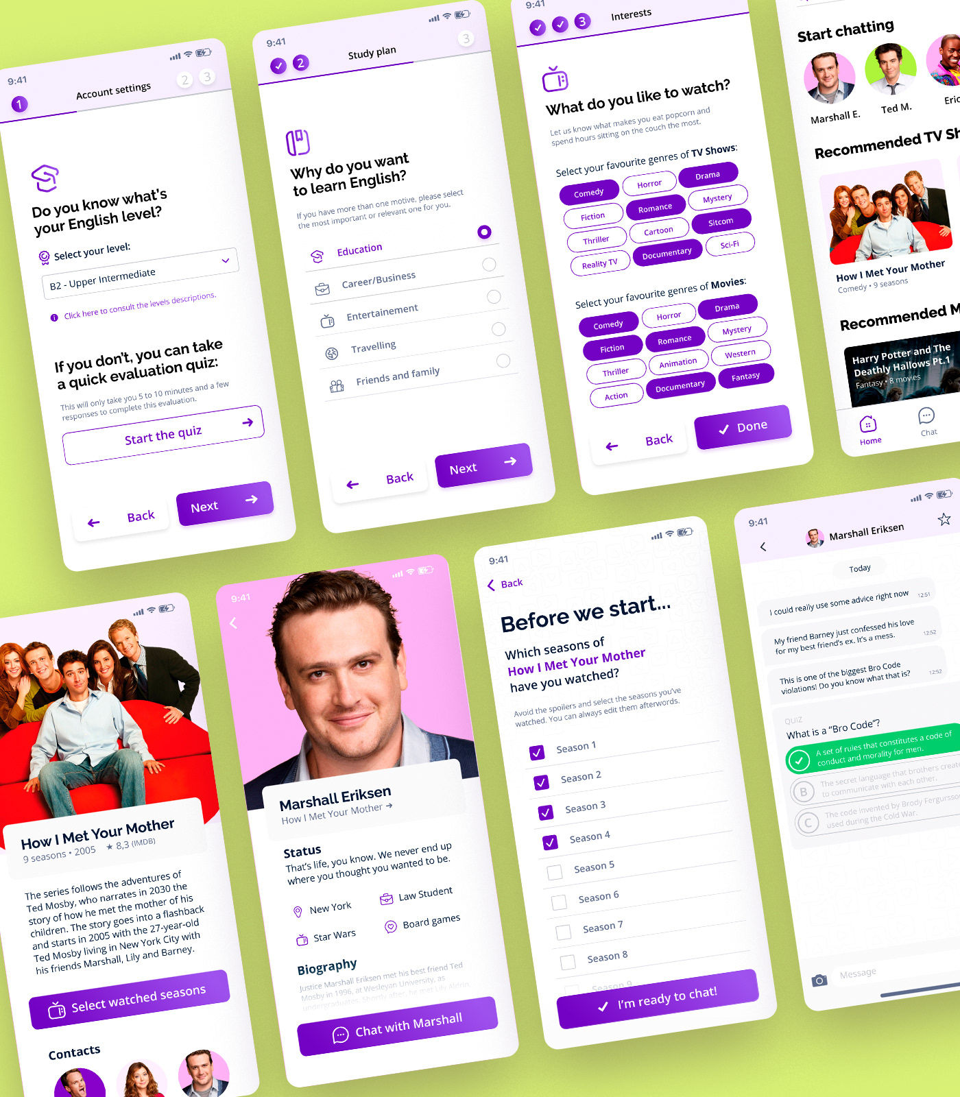
It’s an app that turns learning new languages into a fun experience. By bringing to life characters from TV shows and movies, the app makes it possible for users to chat with their favorite ones, using on-screen scenarios, contexts and vocabulary to provide a more relational and entertaining experience. The main goal is to promote a much more immersive and entertaining experience than the average language app, while maintaining the educational aspect and challenging nature of the process.
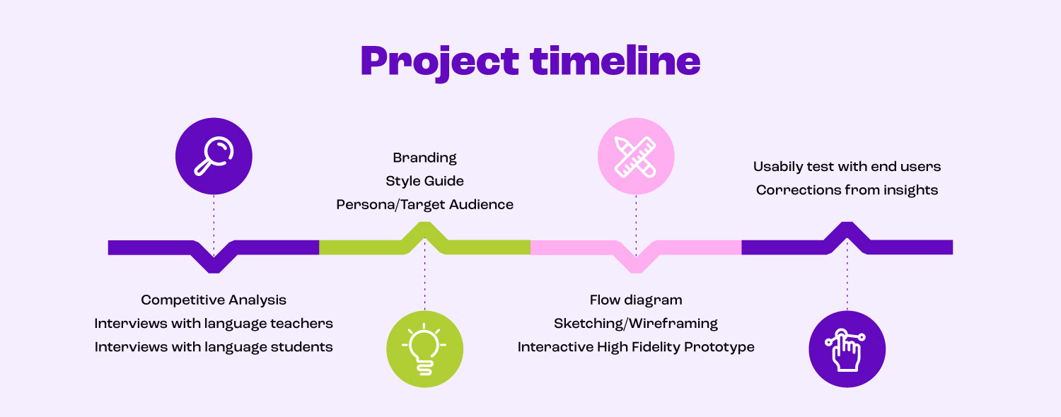
Competitive Analysis
This first stage of the project consisted of research on other language learning apps, platforms and gadgets. Seven different competing apps were analysed: Andy English, Babbel, Duolingo, Mondly, Memrise, Busuu, and the Google Chrome extension Language Learning With Netflix. The method of research was two-fold: firstly, the apps’ main features, interface and content were explored. Afterwards, reviews and articles about them were analysed in order to understand users’ experiences and opinions. With that, the team displayed all the collected data as a pros and cons table:

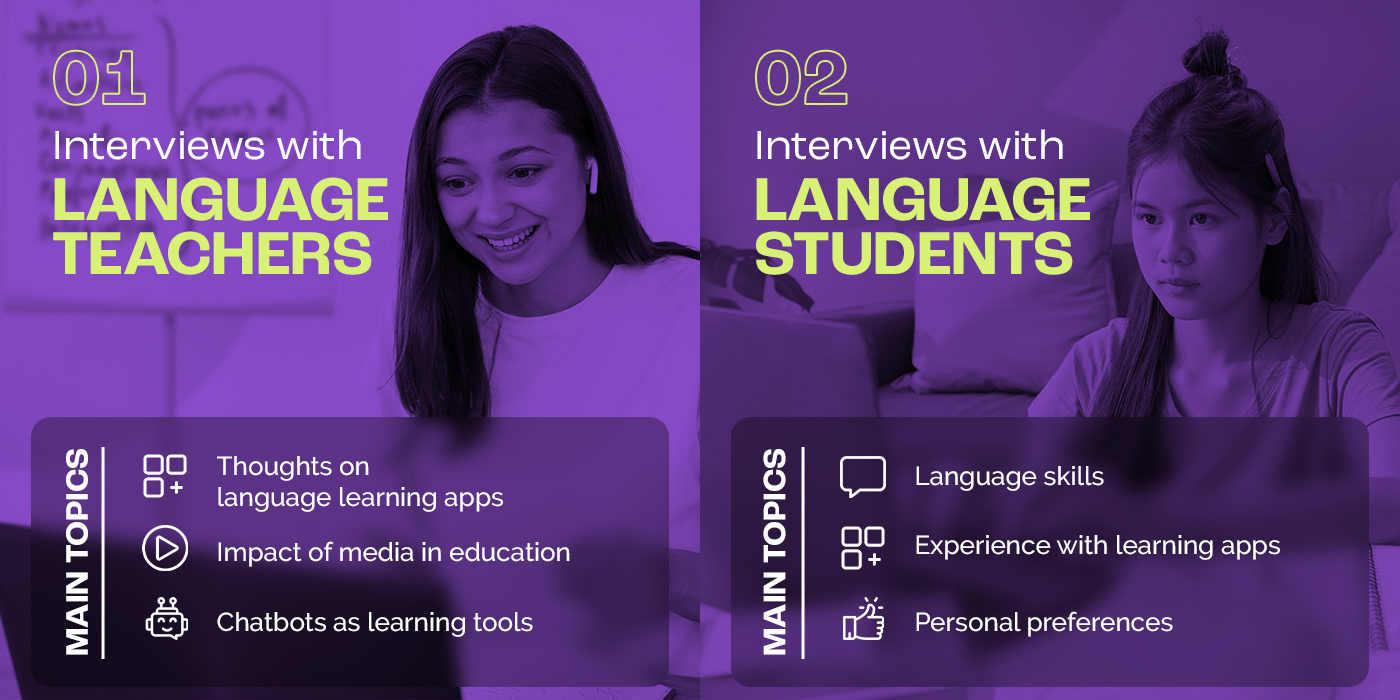
Interviews
We worked on interviews with both target users and experts, with the intent of not only having an empathic approach towards the users but also deepening the understanding about language learning apps — as well as the usage of media, such as movies and TV shows, as a pedagogical and learning tool. Two separate interview scripts were created:
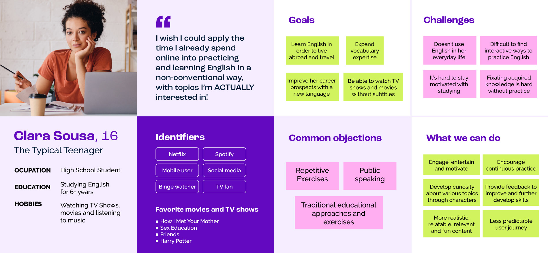
Persona
Based on the information gathered through interviews, a persona was created to present an overview of the main target user of PopTalk.
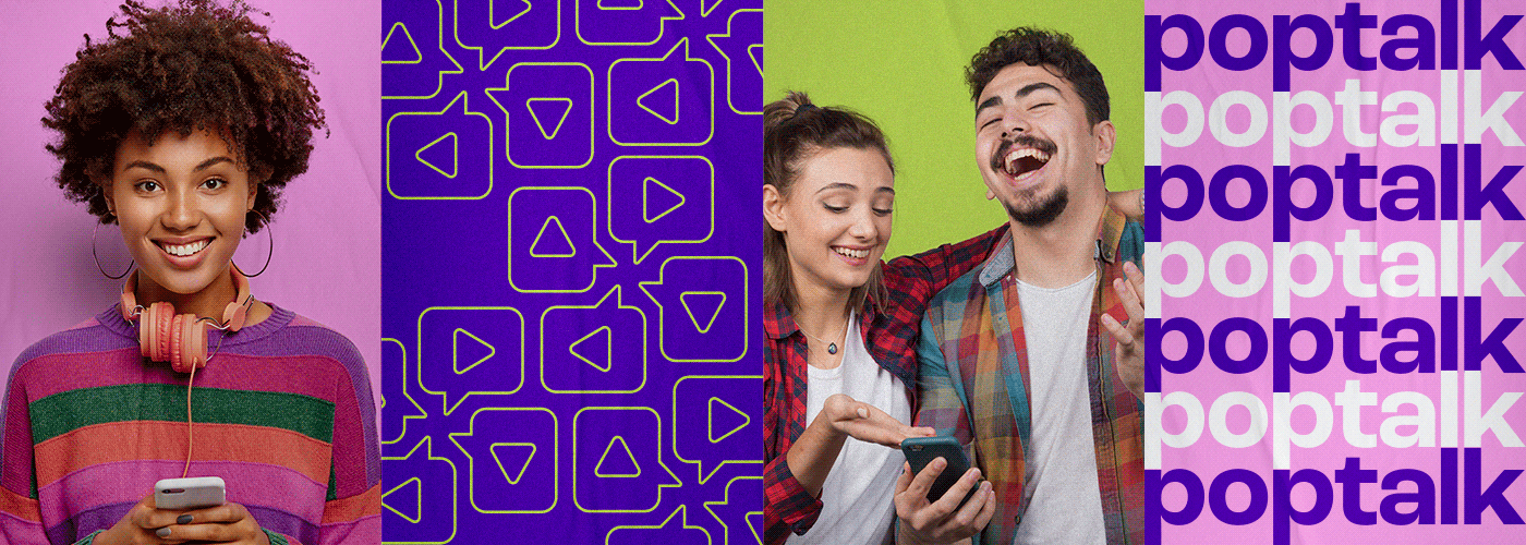
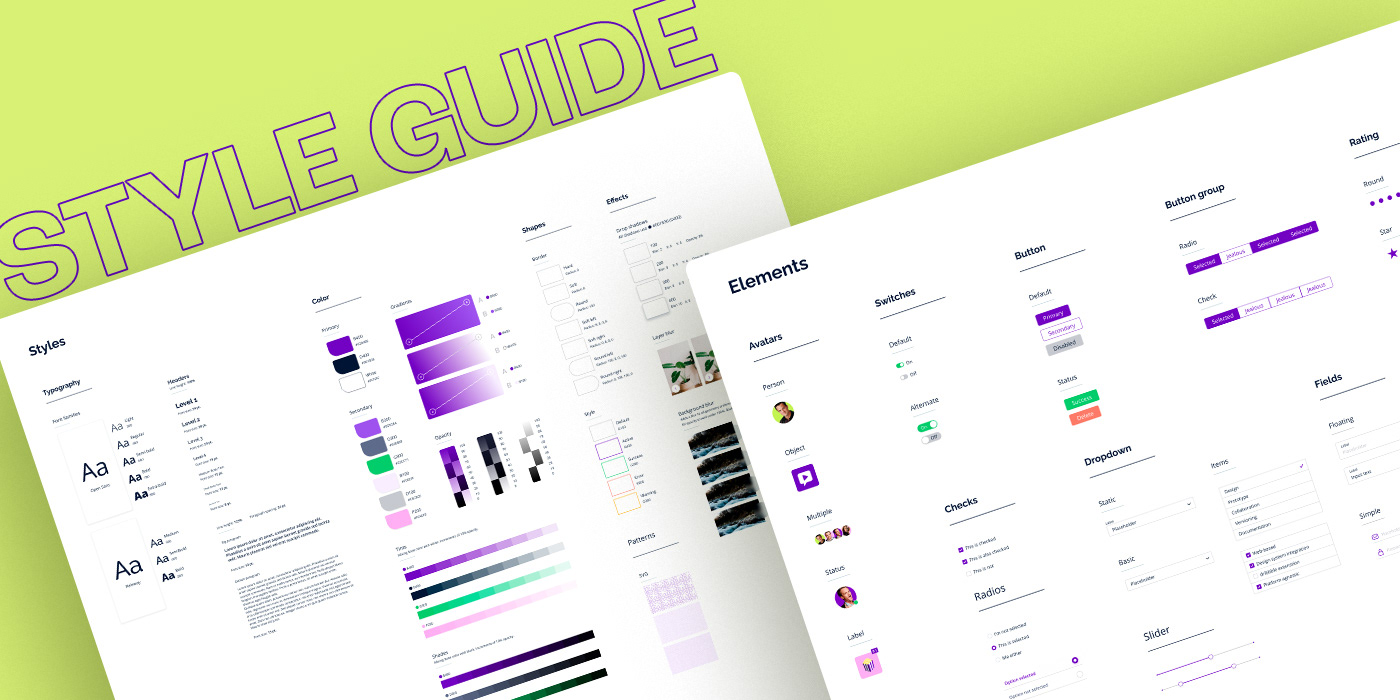
Branding
The name “PopTalk” was selected because not only it makes reference to pop culture and resembles the word “popcorn”, but also contemplates the chat functionality with the word “talk”. The visual identity was developed to tangibilize the app’s concept through an eye-catching visual that conveys the fun, young, bold and modern nature of the app. The symbol represents simultaneously language speaking and audiovisual media consumption. To make sure the color palette was the most accessible possible, a color contrast checker was used to make sure the colors swatches were in compliance with the Web Content Accessibility Guidelines (WCAG).


In sequence, a flow diagram was developed to map the user journey and the screens needed for the first version of the prototype. With that, sketches, wireframes and a style guide were created.
An interactive high fidelity prototype was developed based on the style guide, flow diagram and insights collected through both interviews and competitive analysis.
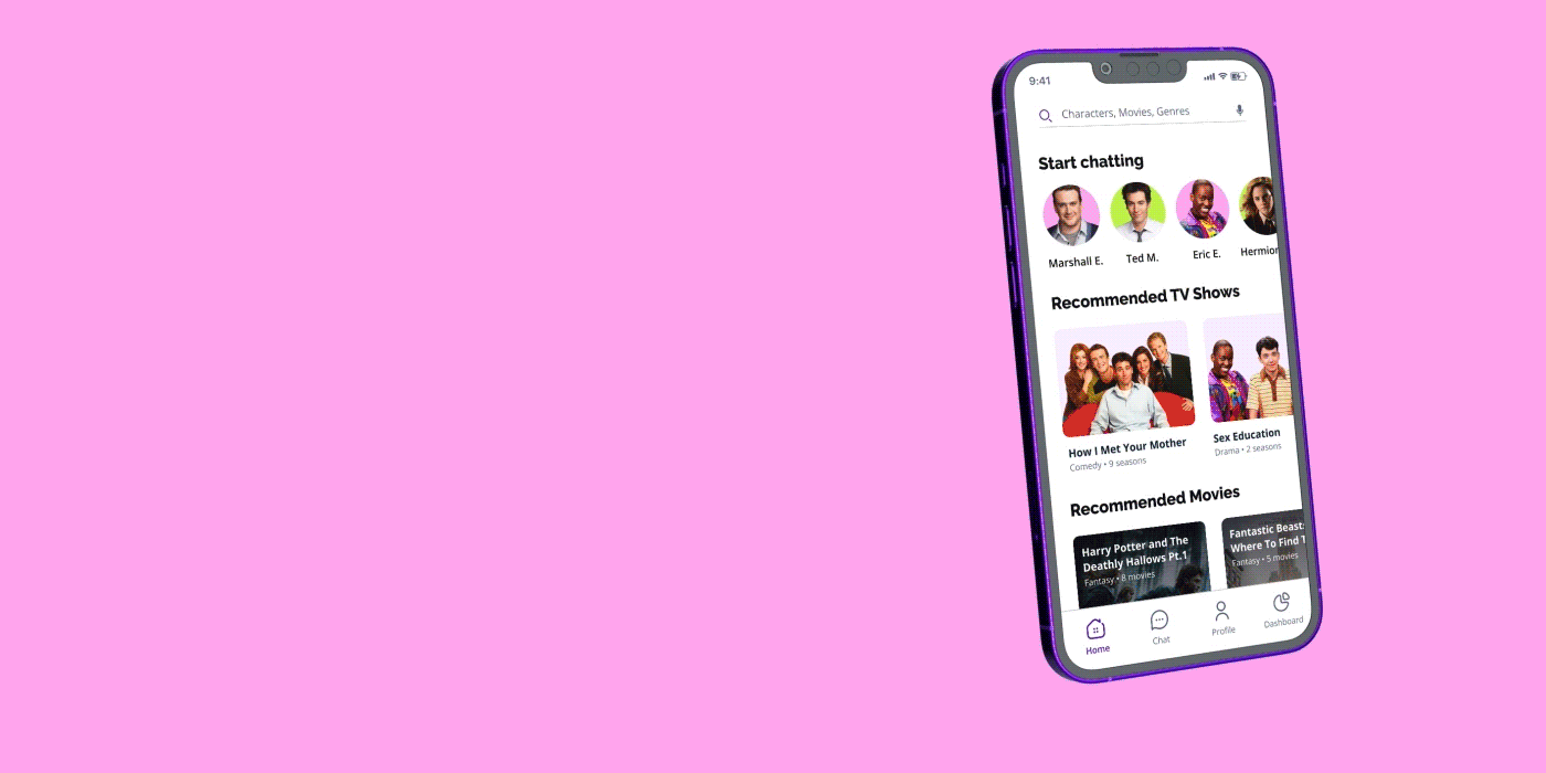
One of the most important features for the app came from the interviews: the selection of watched seasons or movies, in case of franchises. In this way, the user can dodge from spoilers and engage with the characters in a much more immersive way: the topics and content from the conversations with the chatbot will follow the seasons selected by the user.
The on-screen events are updated according to the what the user has marked as "watched", which makes the experience even more fun, dynamic and encouraging.